Data visualisation
Osprai (working name) is a dashboard helps drug manufacturers identify sales opportunities based on disease classification. I was the sole designer on the dashboard, which leverages Optum’s evolving design system. The dashboard lists the healthcare providers at a state level based on the selected filters. The design was successful in three particular areas:
Reuse - the visual styling for the map and the accompanying table are built with the same visual treatment and interactions (this seems to be a novel approach). The providers table is reused from another project.
Continuity - there was a requirement to show national data alongside state summary data in the summary section. The summary section is positioned just below the dropdown menus, and to accommodate both national and state data, the national data is moved up and scaled down to give prominence to the state data.
Consistency - as user navigates between nation and state views, the data types persist between views. In other words, the map and table show the same type of data across all views (seems obvious but earlier prototypes from the data scientists would switch the data type across views). Where it is not possible to show data e.g. provider data at national level, a placeholder is used.
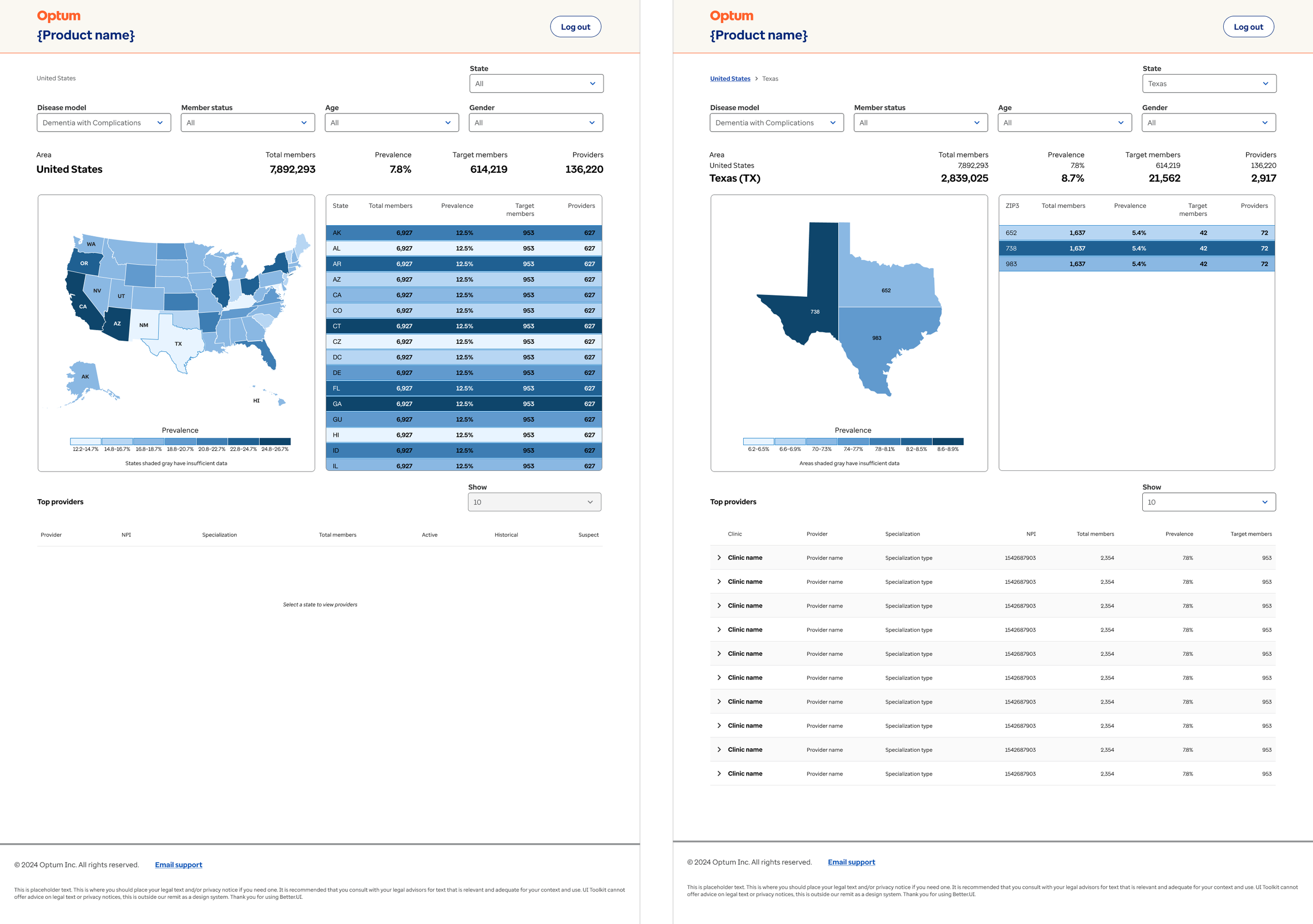
National and state level views in prototype
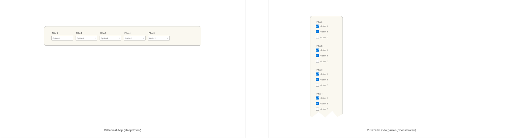
Presentation slides to reach consensus on filter placement
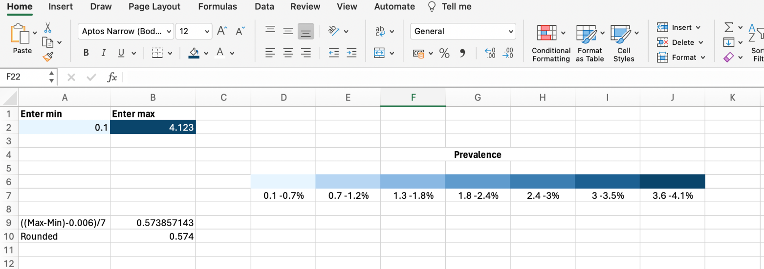
Excel was used to evaluate the number of steps and decimal places to show in the legend